Sunday, May 31, 2009

Dead Tech: Zipatone

Zipatone is an obsolete graphic design material that would let you place a halftone dot screen across an area of a black and white illustration. Also marketed as Letratone, it came a thin plastic film with a slight adhesive over a backing sheet.


The dot pattern came in a variety of gray-tone percentages and in different sizes of dots, measured as lines per inch. The one shown here was a very sophisticated gradated tone.

The way you used it was to place it over your drawing on a light table, cut out the shape with a very sharp knife, carefully lift it, and place it over the drawing. For a very complicated shape, you could place a larger piece over the drawing and cut away what you didn't want.

There were a lot of pitfalls to those steps: cutting through the drawing, getting the stuff to fold up on itself, getting a speck of junk behind it, where it attracted a noticeable shadow. My memories of the stuff aren't that happy and glowing.

Previous Dead Tech post on waxers.

Saturday, May 30, 2009

Spiderwick Meets Dinotopia

Tony Diterlizzi asked a bunch of his art friends to do drawings set in the Spiderwick cosmos. The drawings will appear in the back of an upcoming omnibus edition of Spiderwick stories.

I drew Hogsqueal riding Bix.


Here’s a movie of the work in progress, drawn with a Niji water brush filled with Higgins Eternal ink.


I gave the original to Tony and he reciprocated with this nifty drawing of Will Denison meeting a befeathered Bix. I love it!

Read how he developed his drawing on his blog, link.

Blog Hardware

Everyone's saying how the Internet is going more and more to mobile platforms. So I’m just curious: what sort of tech do you use to view this blog? Please check all the boxes that apply in the poll at left.
-----
Poll results added later:
Desktop computer: 232
Laptop: 195
iPhone: 24
Other mobile device: 9
At work: 102
At home: 249
Art studio: 117

Friday, May 29, 2009

Flying from the Nest

Remember the four robins that just hatched from their eggs on May 15? Link to that post.

In exactly two weeks, they grew up, opened their eyes, and fledged. Both parents helped with the feeding, something that doesn’t always happen in robins.
This morning all four flew successfully from their nest platform into the big dark woods. The parents gave them chirps of concerned attention after their first unsteady flights.

Thursday, May 28, 2009

Pyle on Light and Shadow

Today we continue looking at Koerner's notes from Howard Pyle.


LIGHT


All things in sunlight are lighter than white in shadow. (See GurneyJourney post on this subject, link.)

A picture is more articulate where the light is concentrated on certain part rather than on all of it.

In a diffuse light everything is soft and close in tone.

Treat lamplight similar to sunlight, only shadows are denser.


SHADOW

Keep your shadows the same strength.

If you face strong sunlight in a picture your color is in your shadows.

In painting anything, don’t get different qualities in your shadow.

After picture is right in tone, finish up by studying edges and keep your shadows out of the light.

If two or more figures are together you can bind them together by running a shadow of same strength from one to the other.
-------
Images from the Atheneum, link.

Wednesday, May 27, 2009

Pyle on Tone and Edges

Many of you have asked for more classical art teachings from obscure primary sources. So today and tomorrow, I’d like to share some rare nuggets from Howard Pyle.

Mr. Pyle didn’t write down a lot of theories because he was suspicious about systems or formulas. He believed that pictures were made by inspiration, not by analysis. “The student learns rules,” he said. "But all the rules in the world never make a picture.”

Fortunately he did speak about his ideas of picturemaking during class sessions at the Brandywine school. Several of his students wrote down what he said. One good set of notes comes from W.H.D. Koerner, who became a notable illustrator of western subjects.

TONE

Keep your picture simple in tone. The fewer the tones the simpler and better your picture. The more tones in a picture the harder [it is] to do.

If a face against the light seems dark, it sometimes can be lightened by darkening the hair or hat.

If you feel your white isn’t light enough, make it still lighter.

Keep pretty much same tone quality in flesh and white cloth except in the shadows.

A white coat in a room must be a trifle darker than your white light out of doors.

Forget your drawing and stick to tone. If you get balled up on a part of picture, go back to the tone and don’t rely on drawing.


EDGES

The study of edges is the main thing, outside of tones.

One way to get a spiritual feeling in a certain figure [is to] keep everything softer in that figure than in other parts of picture and let light radiate away from it.

Tomorrow we’ll look at Koerner’s notes from Pyle regarding light and shadow.

Tuesday, May 26, 2009

Vine Growth

Next time you draw a vine wrapping around a branch, here are a couple things to keep in mind.
Each type of vine follows different genetic rules. A bittersweet vine always winds counterclockwise as it ascends.

This large bittersweet vine was once a small spiraling tendril wrapping around a young sapling. Later the vine vaulted to a bigger tree, and kept getting thicker until it was far thicker than its original host. Finally the small host sapling died and rotted away, leaving the vine looking like a telephone cord.

This real telephone cord wraps in the opposite direction, clockwise as it ascends.

As with the telephone cord, the wisteria vine wraps clockwise as it goes up, unlike the bittersweet vine we saw earlier, which wrapped counterclockwise.


In this YouTube video of a morning glory vine, you can see the leading tendril trying to find a host as it spins counterclockwise.

Monday, May 25, 2009

Memorial Day


On this Memorial Day: honors to those who have served in war, and also to those who have acted bravely through other means to avert war.

The sketch is from the West Point Museum, on the grounds of the U.S. Military Academy in New York, one of the largest collections of militaria. Link to their website.

Sunday, May 24, 2009

Fedkiw’s Math and Magic

Ron Fedkiw, who works in the computer science department at Stanford University, has helped develop the software to solve a lot of complex 3-D modeling challenges.

How does hair behave when you shake your head, for example? There are complex interactions at the micro and macro levels.

Fedkiw’s analytical process involves math and physics concepts like topology, fluid dynamics, and “robust invertible quasistatic simulations.”


Never since the Renaissance has the field of visual art been exposed to such fresh new thinking that blends so many different disciplines.

For those of us who work in traditional media, the digital work of Fedkiw and his colleagues is a stimulating inspiration, because it helps us understand more about what we’re drawing and painting.
-----
See a full gallery of Ron Fedkiw’s works here.

The hair was created with the help of Andrew Selle and Michael Lentine
Fire with Jeong-Mo Hong, Tamar Shinar, Duc Nguyen and Henrik Jensen.

Saturday, May 23, 2009

Menzel: Beyond Appearances

He was small in stature, only four feet, six inches tall. When he was young, his peers called him the “Little Mushroom.” When he got mad and fought back they called him the “Poisonous Mushroom.”

Although he was intelligent and witty, he spoke gruffly, not wanting to be pitied. He kept to himself and never married. (Portrait of Menzel by Boldini).

Adolph von Menzel (1815-1905) did have one constant companion: his sketchbook. An acquaintance recalled:

“In his overcoat he had eight pockets, which were partially filled with sketchbooks, and he could not comprehend that there are artists who make the smallest outings without having a sketchbook in their pocket. On the lower left side of his coat, an especially large pocket was installed, just large enough to hold a leather case, which held a pad, a couple of shading stumps and a gum eraser.”


He was self-taught. He didn’t care for the idealization of the academies. He wanted to draw things as they were. He worked in all media, but his drawings, generally made with soft graphite are the most surprising and disarming.

He did innumerable studies of poor people. He was one of the first artists to portray the inside of a factory.

He also painted royalty. In this scene of a fancy ball, he couldn’t resist including a group of gentlemen gobbling food (lower left), an undignified, but very human act.

His drawings show a universal empathy. Perhaps because of his own unusual appearance, he was fascinated with chronicling the physiognomies of his fellow humans with a fusion of frankness and compassion.

In Menzel’s work, grace often lies hidden behind unglamorous appearances. He once said, “A person not only acts with, but also has, a certain external appearance, and the latter is as inconsequential as it is accidental.”

Quote is from “Adolph Menzel, Master Drawings from East Berlin.”
-------
Links added later:
Menzel post on Bearded Roman, link.
Wikimedia Commons gallery, link.

Friday, May 22, 2009

Remembering a Face

One time a few years ago Jeanette and I encountered a crazy guy on the street. He started yelling at us out of the blue. When we returned home an hour or two later, a little shaken, we set the challenge of drawing him from memory.


Jeanette’s drawing is on the left, and mine on the right. We both got the beady eyes, the broad nose, the brow ridge, the spiked hair, the lines around the mouth, and the stubble. Our recollections varied in the head shape, the mouth, and the ears.

I don’t know if the cops could identify the guy based on our memory sketches.

This exercise gave me even more appreciation for Mort Drucker, the master of drawing faces from memory. If the legends is true, he did many of the MAD magazine movie satires from his recollection after simply watching the movie once through.
-------

Mort Drucker image from "One Flew Over the Cuckoo's Nest" courtesy Mike Lynch’s blog:

Lines and Colors post on Drucker:

GurneyJourney Memory Series
Part 1: Art and Memory
Part 2: Memory Game
Part 3: Remembering a Face

Thursday, May 21, 2009

Memory Game

Are you ready for a visual memory game? Please stop what you’re doing and grab a pencil and paper, and try not to scroll down to the pictures yet.

Without looking at a map or searching on the computer, draw from memory the shape of your state or province. People from Wyoming or Colorado can draw Texas.

When you’ve finished that, draw the outside shape of the continental United States—or of your country, wherever you live.

It doesn’t have to be too detailed, and don’t worry if you’re not sure, just give it a try.

On the left, below, is what Jeanette came up with for New York state. Mine is in the middle. I’m a little embarrassed of mine! I’ve driven all over the state, and I mistakenly thought the western end was squared off. But both of us got Long Island at least.

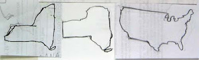
On the right is my memory drawing of the continental US. It’s got quite a few mistakes, especially around the Great Lakes, but it’s not too bad. The only reason it’s OK is that I’ve played this game before.

Now the next step is to find a map and look at it as long as you want: two minutes, five minutes, or longer. But only look one time! When you’re done looking, go somewhere and draw the shape again.

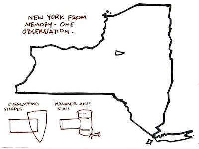
My second pass at New York State is better, but still has a lot of things wrong. I tried to conceptualize the shape as I observed it by thinking of two overlapping shapes, or of the metaphor of a hammer hitting a bent nail.

Here’s what I learned:
1. I tended to enlarge areas that I’m familiar with.
2. It helps to have a metaphorical symbol of something you need to remember.
3. When observing to remember, as Gannam said yesterday, the eye is much more searching, and takes a greater interest in the relationship of large and small shapes.

Thanks for all the great comments yesterday, everybody. Tomorrow's topic: Remembering a face
Memory Series
Part 1: Art and Memory
Part 2: Memory Game
Part 3: Remembering a Face

Wednesday, May 20, 2009

Drawing from Memory, Part 1

N.C. Wyeth once said: “Every illustration or painting that I have made in the last thirty years has been done from the imagination or the memory.”

Wyeth quoted a teacher of his, Charles Reed of Boston in advising him: “the faculty of memory has become a lost function among American artists. He (Reed) blamed much of the lack of mood and imagination in their work to this fact.”

American illustrator John Gannam was also a great believer in memory training. He took six months off his busy illustration career to study from nature. But he preferred to observe a scene, jot down written notes or describe it to a friend, and then paint it back in the studio from memory. Gannam claimed “that observation is more searching when it is acting for the memory than when used for immediate transcription.”

In a sense, every observational drawing is a memory drawing. Even when you’re looking at a model, you have to look for some fact and remember it for a split second while you reconstruct that fact on the drawing.

Some subjects require that the observer hold an image a little longer in memory. Moving animals, ocean waves, or sporting events change so fast that you have to study the action in the fleeting moment. Moonlight scenes are usually painted from memory just because in such limited light, accurate color judgments are impossible.

Tomorrow I’ll give you a fun exercise to test your observational memory.

Memory Series
Part 1: Art and Memory
Part 2: Memory Game
Part 3: Remembering a Face

Tuesday, May 19, 2009

Jury Duty

Yesterday I was called for jury duty in Poughkeepsie, New York.


I arrived at the Dutchess County courthouse and sat in a big waiting room with a lot of other prospective jurors. We filled out our forms, watched the big TV on the wall, and waited. After two hours, the Commissioner of Jurors, Hooker Heaton, told us that there was no need for us after all. We were relieved of duty.

I was glad to return home to work, but I was also a little disappointed. I was kind of hoping to get a seat on the jury so I could play at being a sketch artist.

A few years ago, Jeanette got the call. She made it all the way to jury selection. She did a sketch of Mr. Vasti, the plaintiff’s attorney in a civil case.

Sunday, May 17, 2009

Easel on Rails

In this photo of Pascal Dagnan-Bouveret, the artist is leaning on crutches in front of a very unusual easel arrangement. He seems to be in an indoor-outdoor space. There is at least a partial greenhouse window or frosted glass diffuser overhead and a drape behind him to cut down on reflections.

The easel is mounted on four small railroad wheels resting on a track. There’s also a circular ring under the easel which might allow the easel to turn sideways.

I asked Professor Gabriel Weisberg, one of the world authorities on Dagnan, to comment. He said no specific information has surfaced about this particular photo.

About the crutches, he said, “I don't think he was debilitated in any way when this was taken. It all is part of his steadying himself.” About the rails he speculated that “perhaps he wanted to get closer to actual models or move with changing light conditions as he worked partially outside.”

The only thing I can figure is that he got the idea for using rails from the practice of some sculptors, who rely on railed carriages to move very heavy stones or bronzes in and out of the studio.

Photo from Against the Modern by Gabriel Weisberg

Saturday, May 16, 2009

Tangencies

A tangency is a point of contact between one shape and another so that they just touch without overlapping. A tangency can also happen when a shape touches the frame of the composition.

This picture by Howard Pyle is full of tangencies:
1. The pirate’s hat with the top of the picture
2. The ship with the shore
3. The chin of the far pirate with the dark hillock
4. The tip of the sash with the head of the digger
5. The tip of the shovel with the frame
6. The head of the kneeling man with the digger’s elbow
7. And the stock of the rifle with the man’s head.

Tangencies cancel out the illusion of depth. They reinforce the flatness of a picture. They’re often regarded as a common beginner’s mistake.

So why did Pyle use them? He was a master of composition and he usually knew exactly what he was doing. The idea of deliberately flattening a picture was very much in vogue at the time Pyle did this picture. His pen and ink works were influenced by Walter Crane and Aubrey Beardsley’s decorative approach to line. Pyle must have wanted the piece to be flat like a playing card.

Do the tangencies help this particular picture? As much as I admire Pyle, in my opinion, they don’t here. They call attention to themselves and get in the way of the larger ideas of story, characters, or mood.

Friday, May 15, 2009

ABC: Harper

The 15th of the month is the day for a group sketch game called "Art by Committee." I share an excerpt from a science fiction story and you visualize it.

This month's quote was: “The harper began to sing. His deep voice was fine and sweet, eloquently expressing his intent. He sang of the bitterness of defeat and the gut-wrenching carnage of war. He sang of boys…”

Your solutions took the quote in a lot of interesting directions, from lyrical to surreal to surprising to straightforward.

Damian Johnston
Website

Wendy de Wolfe
Blog:

Rachael Haupt
Website
Andy Wales
Blog:

Mei-Yi Chun
Website:

Mark Heng
Blog:

Mario Zara
Blog:

Jeremy Hughes
Blog

Marisa Bryan
Flickr:

Patrick Waugh
Blog

And the one in the original sketchbook, which I hasten to explain was drawn by a whole group of science fiction artists at a fantasy convention. They were making a little fun of the tradition of filking, a brand of folksinging that could be found at cons.

For June let’s try the business card game. I picked up this card more than twenty years ago. It was publicly displayed in a restaurant along with thousands of others, but I blurred out the last name anyway. I don’t know anything about the person except what’s on the card. Your assignment is to illustrate the owner of the card and his or her profession based just on the card itself.

Have fun! Please scale your JPG to 400 pixels across and compress it as much as possible. Title it with your name, send it to: jgurneyart(at)yahoo.com, subject line ABC. Please let me know in your email the full URL of the link to a larger image or your blog or website so people can see your image in all its glory and learn more about your other work. Please have your entries in by the 13th of June. I'll post the results June 15.

Robin Hatchlings

Here’s the scene outside my back door as of a few minutes ago. There are four robin hatchlings. They all quiver together when they hear a noise. It’s a great effort for any of them to lift up their heads.

Thursday, May 14, 2009

Multitasking

Howard Pyle provides probably the ultimate example of multitasking while painting.


One of his students, Thornton Oakley, recalls:

On the stairway landing I found my teacher at his easel, working on a canvas for his series “Travels of the Soul,” his young children cavorting about his knees, a model posed nearby in costume to give him some detail of texture, Mrs. Pyle sitting beside him reading aloud proofs from King Arthur for his correction, he making comments for his notation.”


That kind of brainpower is a remarkable achievement, way beyond me, that’s for sure. But I find that while my mind is engaged in painting, there are chunks of grey matter sitting around idle. Engaging those areas with non-visual tasks makes me paint more intuitively, which helps.

You all offered some great comments on an earlier post about listening to music or books on tape. When it comes to enjoying the company of young children or pets, I’m in agreement with Pyle. When my kids were young, there was always a lot of commotion going on in the studio, and it strangely helped my concentration.

Wednesday, May 13, 2009

G.P. (Golden Palm)

The letters “G.P.” are hidden in many of my science fiction paperback covers from the 1980s.

The letters stand for the Golden Palm, an apartment building that I shared with many other Art Center students.

Many of them have gone on to become well known in comics, illustration, and painting. They include Paul Chadwick (Concrete), Bryn Barnard (Writer, Illustrator, Muralist), Thomas Kinkade (Painter of Light), Ron Harris (Crash Ryan), Alan Munro (Visual FX), Mark Verheiden (Writer), and David Mattingly (Animorphs Illustrator).


We all called ourselves “GP-ers,” and we got together for sketch groups, field trips to movies and museums, and art-themed potlucks.

I’ll send a free Dinotopia map to the first person who correctly names all of the covers from which the details above are excerpted.

Tuesday, May 12, 2009

Revell’s Rembrandt

Jack Leynnwood was the Rembrandt of Revell plastic model boxes.
Leynnwood was a teacher at Art Center, where I went to school, but I don’t think the school administration valued him enough at the time. In my day, the only place he taught gouache painting was at off-campus seminars, where I had the privilege of watching him paint a demo of a red car.

In 1965, the Revell company turned to Leynnwood to paint the box cover for their model of the Army Air Force B-24D.

When Revell switched to using photos instead of paintings on their boxes, I lost interest in plastic models. I didn’t want truth in advertising. I wasn’t just buying a box of plastic parts. I was buying the whole fantasy. And no one understood how to deliver that fantasy that better than Jack Leynnwood.

Read more about this painting and the aircraft shown at The Box Art Den, link.
Here's an even better link called Old Model Kits.

Monday, May 11, 2009

Tonal Focus

Here are two ink wash drawings of a picturesque street scene. They’re very similar. There’s an upper and a lower arch. The light is coming from the upper left in both scenes, and the figures are all in the same places.

As you look at both pictures, do you find your attention is attracted to a different part of each picture? What is different about them?

Arthur Guptill, in his book Color in Sketching and Rendering, provides this example to show how tonal arrangement can help create a focal area.

His purpose with the picture at left is to draw the eye to the upper arch by means of strong lighting and punchy contrast. The second picture has the tonal focus on the lower arch.

I found that my eye moved the way he intended, but I may have been influenced by his discussion in the book. How did it work for you?

Sunday, May 10, 2009

Art Carts and Art Education Survey

The Lehigh Valley Arts Council in eastern Pennsylvania just published a survey about how the arts are faring in schools. It’s a regional survey, but it probably speaks to problems that face art teachers everywhere, especially in these tough economic times.

A few of the findings:
1. Fewer and fewer art teachers have their own dedicated classrooms, and many are heroically teaching from art carts. Schools with limited space often replace art classrooms with computer rooms.

2. Collaborations between art teachers and other curriculum areas, such as geography or science, are much more common in elementary and middle school levels, and harder to find at the high school level.

3. It’s also harder for high school art teachers to organize field trips or to get support from parents and funding groups.

The arts council is facing these somewhat discouraging trends by reminding parents, business people, and school administrators how important the arts are to the growth of young people. They’re working with an allocation from the Pennsylvania state budget that was cut back more than eight percent from the previous level.

You can read more about the survey, conducted by Paul Dino Jones at Lehigh Valley Live. and Morning Call Newspaper Article.

Press notice
about my keynote at the Arts-In-Education gathering.

Saturday, May 9, 2009

The Cello and The Pencil

I enjoy sketching musicians, partly because I'm in such awe of what they do. This cello student from the Bard Conservatory Orchestra put tremendous skill and feeling into his playing of Dvorak and Schumann.

I'm fascinated by the way musicians collaborate with dead composers to bring centuries-old creations back to life at each performance. Doing so requires a level of skill and depth that we artists can only regard with wonder.

There's really no parallel in art for this act of sympathy with past masters. When we go to art school, we don't make a group practice of copying the Sistine ceiling or the Night Watch. Imagine if Michelangelo or Rembrandt depended on our technical skills as the vehicle for realizing their creative ideas.

As artists we don't have a shared repertoire that we must all master. We simply glance back at the vast sweep of art history, taking sips of inspiration here and there, and then try to find our own way alone.

Friday, May 8, 2009

Fantasy Art in High School

Kathleen Harte, visual arts instructor at Millburn High School in New Jersey, has encouraged her students to use maquettes and posed models to add realism to their imaginative work.


According to Ms. Harte:
“One of the students, Joy Jeong, had to create an image of a young girl riding a giant caterpillar for a series of 12 paintings she is creating based on a story she originated in which giant insects have invaded our world.

Joy had seen your book, Dinotopia, and had heard me tell about the presentation you gave at the Society of Illustrators last year. I had explained how you make models when needed to use as reference and to explore lighting situations. So Joy came in after school and made a rough mock up of her caterpillar. She put a small figure on it that I brought in from my own studio and used a strong light to create her shadows. Combining those photos with one she took of a fellow student, she created the final piece that I have included here.”


Thank you to Ms. Harte, Joy, and Anna, for permission to use your images. I’m impressed with the wonderful results you got from your extra effort. It’s fun to imagine what will happen next in your story world when that caterpillar turns into a butterfly.

For other arts instructors in the Mid-Atlantic region, don’t miss the Dinotopia arts-in-education event tomorrow in eastern Pennsylvania. Here’s the official announcement, and I hope to meet many of you there.

James Gurney, author/illustrator of ''Dinotopia,'' will talk about his fantasy artwork and sign copies of his books about a world where humans and dinosaurs live together in harmony. It's Saturday at Zion's Reformed United Church, 622 Hamilton St., Allentown. Gurney's talk is part of the Lehigh Valley Arts Council's arts-in-education forum. He will talk at 1 p.m., followed by the book signing at 2 p.m. Tickets are $10; $5, students. Info: 610-437-5915, http://www.lvartscouncil.org .