Wednesday, August 31, 2011

Walter Potter’s Taxidermy

English taxidermist Walter Potter stuffed people’s cherished pets for a living.

But he preferred to create anthropomorphic fairy tale scenes using rabbits, squirrels, and kittens made up to look like little people.


[Video link.] This 1960s era film shows museum curators dutifully dusting off his creepily charming tableaus, which were broken up and sold at auction in 2003.

Via BoingBoing
Wikipedia on Walter Potter (1835-1918)
Book: Walter Potter and His Museum of Curious Taxidermy

Tuesday, August 30, 2011

In the Wake of Irene

We were squarely in the path of Hurricane Irene last Sunday. She dumped more than twelve inches of rain on us in less than 24 hours, the most rain since the epic floods in 1973 and 1927.

Luckily it didn’t flood our basement, but it knocked down a few trees in our neighborhood and turned the stream below our house into a raging river.

One place that really got hit hard was in nearby Windham, New York, where the Batavia Kill jumped its banks and headed down Main Street.


The old church, part of which is now a library, is visible on the far side of the bridge. The town is currently cut off from electricity.


I did a plein air painting there a few years ago. Main Street, which ran like a fast river, is the road in front of that green-roofed building, which happens to be a gallery called Windham Fine Arts.


Here's a photo of me painting a few years back, right on the spot that was churning with water on Sunday.


Above is a video compilation of flood drama in the Catskills.

 The flood photo of Windham is from "My Distractions."
Direct link to YouTube video of the flood.

Slow Art

Yesterday's post included this line by Augustus Saint-Gaudens: "A good thing is no better for being done quickly."

This prompted a very interesting rhetorical question by portrait painter Ilaria Roselli del Turco:  "But is a good thing any better for being done slowly?"

Have a look at this video "A Slow Art" by art critic Robert Hughes and let me know what you think.

Monday, August 29, 2011

Saint-Gaudens’ Three Guiding Principles

During his studies in Paris, American sculptor Augustus Saint-Gaudens (1848-1907) came up with three guiding principles for his artwork.


1. Conceive an idea. Then stick to it. Those who hang on are the only ones who amount to anything.

2. You can do anything you please. It’s the way it’s done that makes the difference.

3. A good thing is no better for being done quickly.

LINKS
Wikipedia on Augustus Saint-Gaudens
 From The Greater Journey by David McCullough, Quoted from The Reminiscences of Augustus Saint-Gaudens

Sunday, August 28, 2011

Twenty Top TED Talks

For those riding out Irene, looking for something fun to watch, here’s a list of “20 Amazing TED Talks for Art Majors,” courtesy of Best Colleges Online.

To which I would add the TED talks of
Scott McCloud on Comics
and David Macauley on Rome


20 Amazing TED Talks for Art Majors

Saturday, August 27, 2011

Waterloo by Kopinski

Artist Karl Kopinski has just completed a painting of one of the most challenging subjects imaginable: historically accurate equestrian battle subjects. 


This paintings depicts the First Lifeguards counter attacking the 4th cuirassiers at the battle of Waterloo 1815. The painting went through innumerable pencil and color sketch stages.


He says: “I first started the painting over 3 years ago, but due to my workload I could only manage to work on it sporadically, which became quite frustrating, although it did allow me to do quite a lot of preparatory work for most of the figures. I spent a lot of time looking at the great French military painters, Meissonier, Detaille and deNeuville."


“I also had to do an awful lot of research into uniform details, I managed to get a lot of help including a friend of mine who is a Saville Row tailor and also an expert on Napoleonic tailoring, I also managed to borrow a helmet and cuirass from a similar period along with a very well made reproduction uniform of the period.”


Karl Kopinski's website
Books: L'Armee Francaise: An Illustrated History of the French Army, 1790-1885
Ernest Meissonier: Retrospective : Musee des beaux-arts de Lyon, 25 mars-27 juin 1993 (French Edition)
Ernst Meissonier and Art for the French Bourgeoisie: Master in his Genre


Friday, August 26, 2011

Flesk Prime

Publisher John Fleskes has just released a new art book featuring work from five artists from the fantasy/comics/film concept arena: Craig Elliott, Gary Gianni, Petar Meseldžija, Mark Schultz, and William Stout. He calls the book Flesk Prime.

The book serves as a snack sampler for those who aren’t familiar with some of the artists. Flesk has full-length books available on each of the five featured in this one. 

Each chapter begins with a brief bio with new interview bits and about 15 pieces of artwork, beautifully reproduced, as always with Flesk books. The hardcover book is 64 pages long and retails for $24.95. John doesn’t sell through Amazon, but you can get a copy through his website.

More about the book at the Flesk blog.

Thursday, August 25, 2011

First Calf at the Fair

The Dutchess County Fair in Rhinebeck, New York, had all the usual fun, but for me the highlight was seeing the first calf born at the fair.


This two minute video ends with my sketch-encounter with the calf named “Trouble.” He was born at 1:00 a.m. When we saw him stagger to his feet he was just nine hours old.


When I mentioned to the farmer that he didn’t seem too steady yet, he laughed and said, “If we let him loose right now, he could run faster than I could.”

Wednesday, August 24, 2011

Sketching the Cartoon Guy

Yesterday I visited the Dutchess County Fair in Rhinebeck, New York. It was early in the morning on opening day.


A caricaturist named Mark, the “Cartoon Guy,” was set up under his white tent, waiting for customers.

I did a blog post about Mark three years ago. He had a new sign out that said “Please don’t text while you’re posing.”


I hung out with him until he got his first customer of the day, a girl who had never been drawn before. During a lull Mark and I drew each others’ portrait.

Previously: "The Cartoon Guy"

Tuesday, August 23, 2011

Transitioning Edges

One way to achieve a soft, moody look in a painting is to ease the transitions across the edges.

Instead of losing the edge by blurring it, the idea here is to keep the edge sharp, but lighten up to the tones on one side of the edge and darken down to the edge on the other. The edge is there, but it feels softened.


For example, in the Fritz von Uhde painting "Schwerer Gang" above, the roofline of the building is lightened as it approaches the realm of the air. The forms are almost lost as their edges meet the sky. Likewise where the base of the trees and the figures meet the ground, they seem melted into the dark earth.

There’s almost no chroma to this painting, but it has a great feeling of light thanks to the handling of transitions.


J.M.W. Turner’s watercolors partook of this quality more and more as his career progressed. In this picture called “The Dark Rigi,” The mountain range is sharp only at the top, and blurs off at the sides. All the contours are suppressed by means of value transitions. The boats at lower right are absorbed into the blue vapor of the water.

One must guard against getting too carried away with this device, however. Too much of of this “fiberfill treatment” can take the backbone out of a picture, so it should be used deliberately and with purpose.

Monday, August 22, 2011

Color Grading

When the Coen Brothers made the movie “Oh Brother Where Art Thou” in 2000, they digitized the movie film, which made it possible to manipulate the colors within each scene, just as you can adjust the colors of a still photo in Photoshop.


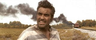
It seemed revolutionary then, but it’s standard practice now. Each shot of a live action film is routinely enhanced or drained of color. This process is called “color grading” or “digital color timing.”


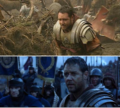
The top image shows the color palette that faced the cameras on location in southern England while filming the opening battle scene in Gladiator, also from 2000. The lower image shows how the sequence appears in the film.

Sometimes the whole scene is pushed toward a given hue to suggest the cool of the night or the heat of the desert. But you can also pick out individual elements and shift their color wherever you want.


Unique artistic effects are possible that were never possible before. In this scene from "Sin City," a portion of the scene is made black and white, and another is brought into color.


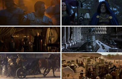
Representative frames each scene are assembled into a chart called a “color script” or a “color bible,” where the director can see the color movement of the whole film in a single glance. Each of the sequences in Gladiator is recognizable at a glance, just from the overall color scheme.

One popular technique recently has been to bring out the warmth of a face while cooling the background in the same shot. Todd Miro, a film editor, has argued that the practice has been taken too far. The skin tones are out of key with everything else, and therefore look unnatural. He argues that such orange skin tones could never exist in such strongly blue environments without golden hour lighting.

LINKS
Wikipedia on Color Grading
Last still from "Transformers Two," from The Abyss Gazes: "Teal and Orange: Hollywood Please Stop"
Book: Color Correction Handbook: Professional Techniques for Video and Cinema


Sunday, August 21, 2011

Your mother was right,

The sensors in your eye that respond to dim levels of illumination are called the rods, and they depend on an extremely light-sensitive chemical called rhodopsin, which contains Vitamin A.

This vitamin is found in strong quantities in sweet potatoes,  spinach, fruit, and yes, carrots. Eat those carrots! They really do help your vision.

Quiringh Gerritsz van Brekelenheim (b. Dutch, 1622 -1669) Vegetable Stall,1656. Image from Food in the Arts

Saturday, August 20, 2011

Book Review: Digital Matte Painting Handbook

I recently received a copy of David Mattingly’s recent how-to book on matte painting called The Digital Matte Painting Handbook. As a longtime fan of any kind of cinematic illusion making, I was eager to read it.

Matte painting has changed quite a bit in the last twenty years, going from painted glass to 3D animated digital environments and Mattingly has stayed on the cutting edge of those changes.

The book comes with its own teaching DVD. It fills an important void in the field of instructional books on the topic, becoming the essential guide to the modern practice of creating cinematic matte illusions.

David Mattingly’s experience makes him the ideal author. He began his career with traditional painting skills, apprenticed to the great masters of hand-painted methods, such as Peter Ellenshaw.

When digital tools began to emerge, he was an early adopter. He worked for many years as an illustrator of the Animorphs books, one of the early books to use digital illustration techniques.

He has stayed ahead of the curve with both 2D and 3D techniques, applying his professional expertise in an impressive array of movies.


To top it off, he is a clear writer and sympathetic teacher with years of classroom experience, teaching matte painting now at the School of Visual Arts and Pratt Institute in New York.

The book presents the reader with a series of problem-solving challenges and specific tasks, one being a a Scottish castle on top of a bluff overlooking the sea.

Everything is well illustrated at each stage. It’s loaded with everything from aesthetic principles to practical tips and tricks, guiding the reader step by step into an exciting field of movie artistry.

LINKS and RESOURCESThe Digital Matte Painting Handbook
Book on the visual history of matte painting:  The Invisible Art

More about the book from the author on Matte Painting.org
David Mattingly's website

Friday, August 19, 2011

The Value of Black

Classic comic artist Roy Crane (1901-1977) reminds us of the compositional importance of black.

“Get all you can,” he said in his famous scrapbook. “But use it mainly to bring out the color of white.”


Applies to painting, too. (Rembrandt, Descent from the Cross)

Wikipedia on Roy Crane
More pages from the scrapbook at the blog "Hairy Green Eyeball."
Books: Captain Easy, Soldier of Fortune: The Complete Sunday Newspaper Strips 1933-1935 (Vol. 1) (Roy Crane's Captain Easy)

Thursday, August 18, 2011

New Yorker Blog Post


The New Yorker official blog has just shared the results of our "Unfinished Cover Contest," along with an article that tells the story of how it came to be:

James Gurney, an author, illustrator, and creator of Dinotopia, from Rhinebeck, New York, saw the blank space on George Booth’s July 4, 2011, cover and felt inspired. “I’m a fan of Booth and have always loved his drawings, but for an artist, a patch of white paper is like a red flag to a bull,” Gurney told me by phone. To the left of the dog peering out a window at a canopy of American flags, Gurney drew a second window, this one with a cat hanging from the sill. 
Doctoring magazine covers is a hobby of sorts for Gurney. “When a magazine lands on the breakfast table, I reach for the Sharpies—lots of mustaches on Mona Lisas in the house,” he said. Gurney suspected that he wasn’t the only person who did this, so, in the spirit of the Cartoon Caption Contest, Gurney decided to launch the “unfinished-cover contest,” encouraging other artists to submit their scrawls. “Five minutes after I put up the call, I started to get responses,” Gurney said. “Think of the possibilities: you could run more half-finished covers or you could run art reviews that are half-finished. I, for one, would be happy to finish columns for Peter Schjeldahl.” 
“I don’t get it,” Schjeldahl responded. “What self-respecting writers or artists wouldn’t hate the idea of anybody messing with their work? I sure do.”

Read the rest of the article.
Thanks Emily Kan


New Yorker Cover Story: "More than Mona Lisa Mustaches" by Emily Kan
Finalists of the contest.

Checkerboard Illusion Video


Here's an impressive video version of the "checkerboard illusion." The lighting conditions in the room are set up to trick us into thinking the low light is the main light in the scene, but actually the top light facing down is dominant.

The giveaway is the lack of a cast shadow of the whole checkboard table onto the floor from the purported key light. They should have painted that, too.

Thanks, Jocque

Practical Lights, Part 3

This is the third installment on practical lights, which are lights that appear inside a picture.


With imaginary subjects, we have considerable latitude in how we adjust the color balance and intensity of a practical light. For example in this scene of the sleeping barns in Dinotopia: A Land Apart from Time, I let the lamp influence a small area of Will’s sleeping basket, and then introduced cool moonlight across the forms of the sleeping dinosaurs.

This would not have been possible in an photographed scene, but it served the mood of the painting.

Wednesday, August 17, 2011

Practical Lights, Part 2

Yesterday we looked at practical lights from the point of view of the plein air sketcher.

They also present unique challenges for lighting designers in movies.


In film’s earlier days (above "Mildred Pierce" 1945), film stock wasn’t as sensitive as it is today, so if an actor flipped on an electric light or lit a match, a supplemental light from outside the shot would often have to be switched on at just the right moment to shine on the actor’s face.


In an interior scene where practical lights are visible, the bulbs used (called “practicals”) are generally in the 250 to 500 watt range, and their color is whiter. Normal household bulbs are generally more reddish than other lighting instruments.


Today, more sensitive cameras and digital tools give lighting designers more flexibility. Here’s a screen grab from a film in which Gary Natrass was the Director of Photography. He achieved the natural look in the following way:


“It is lit with just two practical lights: a 100w tungsten bulb in the standard lamp and a 60w tungsten bulb in the table lamp, the fire is real and it was shot on an HPX301 AVCIntra 100 1920x1080i 25np, the camera was set to tungsten balance 3,200k.”

 Mildred Pierce set from William Miller Design
Gary Natrass on Film Production Techniques Forum
Practical Lights, Part 1
Books: Film Lighting: Talks with Hollywood's Cinematographers and Gaffers
Set Lighting Technician's Handbook, Fourth Edition: Film Lighting Equipment, Practice, and Electrical Distribution


Tuesday, August 16, 2011

Practical Lights Part 1

Practical lights are light sources that originate from within a scene.

The top photo shows a pub in Malta as it appears in daylight. The middle photo was taken at night, with the neon, fluorescent, and incandescent lights all interacting. Each has a distinctive color corona around it, and each influences the area nearby. Note the mixing of light on the awning at right.


The bottom image is a 5x7 inch watercolor painted at night from observation from across the street. Even though the neon was intensely chromatic and very high in value, I knew I would have to bleach it, flare it, and use the color corona to get across the brightness. I couldn’t go any brighter than the white of the paper.

The brightness and color of a practical light is more evident from its effect than from the appearance of the light source itself.

To do a plein-air nightscape, I had to have just the right illumination on my work, and fortunately, the park bench where I was sitting had some spilled light from a hotel behind me so I could more or less see what colors I was using.

Monday, August 15, 2011

Lovell Article

The new issue of Illustration magazine has an extensive feature on the American illustrator Tom Lovell (1909-1996). The article has 67 illustrations, mostly in color.


Lovell’s career spanned six decades, beginning with covers and black and white drybrush drawings for the pulp magazines. He went on to the mainstream “slick” magazines, specializing in historical, adventurous, and romantic subjects.


His dedication to research and accuracy culminated in landmark articles for National Geographic throughout the 1960s, including multi-painting features on the Vikings and the life of Abraham.

I had a chance to meet him and correspond with him, and he was probably the biggest single influence on my early work. A lot of what I learned from him appears in the following links, and in Imaginative Realism.

Illustration Magazine (you can see the whole issue digitally)
Previously on GurneyJourney:
Lovell on Pyle and Dunn
Lovell on Flesh Tones and Design
Lovell's Painting Advice
Lovell's Soldier
Three Value Study

Painting Analysis


Scott McDaniel has done a very thorough analysis of the color and composition of one of my paintings, “Flights of Fancy,” including a gamut map of the color scheme.


It’s interesting for me to read such a post-mortem. I don’t recall thinking consciously about all these things at the time.

I recall playing lots of music and just thinking of the feeling of flying. But his analysis makes sense. I think a lot of things that we think about consciously when we're looking at paintings become unconscious (hopefully) when we're actually in the act of painting. The mind works in strange ways. 

"Ideas Made of Light" by Scott McDaniel
Thanks, Scott!


Sunday, August 14, 2011

Souls on the Banks of the Acheron

In a 1900 edition of the Art Journal, Helen Zimmern described the scene in “Souls on the Banks of the Acheron” by Adolf Hiremy-Hirschl.


“In this picture we see the newly dead hovering on the banks of that river of the lower world which they must cross in Charon’s boat ere they reach their ultimate destination.

“Hermes Necropompos is here fulfilling his important function of conducting the shades of the dead from the upper to the lower world. In Mr. Hirschl’s rendering but few of these souls are glad to leave the sunlit earth behind them. Its joys and attractions still hold them spellbound, only quite a few, mostly young children and old men, are resigned to their mortal fate.


“The dissatisfied shades crowd around Hermes as he strides among them and implore him to relax his step, to stay the march of doom. But Hermes walks on regardless, with the calm inexorableness of a god, walks on and past the craving throng.

“But implacable though he must be to their entreaties, he is not here depicted as deaf and insensible to their sufferings. It is this that gives to his figures a sympathetic grandeur.


“In the middle distance Charon is seen approaching in the boat that shall row these souls to their final abode. It is the sight of his barque on the black waters of the Acheron that has struck the multitude with such terror. The dread passage once made, all hope is ended.”

Adolf Hirémy-Hirschl, Hungarian, 1860–1933. Souls on the Banks of the Acheron, 1898. Oil on canvas, 85 x 134 in.
Vienna, Österreishische Galerie Belvedere.
This painting is reproduced as a double page spread in Color and Light: A Guide for the Realist Painter
Previously: Adolf Hiremy Hirschl